

UX
Project Details
Summary
The project from Medilevel was to develop the UI for their product HIPR. HIPR is a web-based means of communication between caregivers and patients during the titration of ADHD medication.
HIPR creates a clearer basis that allows doctors and nurses to more quickly get an idea of how the medicine works and can make necessary adjustments. The mobile communication enables remote registration, which reduces the number of physical visits to clinics which results in less strain on care and time for guardians.
Through a survey sent to 73 people, we received valuable information on how users feel about the titration of medicine. Results showed that 46% of the participants felt that it was hard making a routine and make time for booking.
Features like schedule and encouraging gamification helped users remember their medication and filling in data by 57% after 3 weeks of use, and security pin with auto logout to create a safer and more secure app for children and teens to use.
Browse the prototype and look around to see how users navigate around. Continue reading below for my extensive process work and how I made my decisions in the design for HIPR.
Role
Tools
Timeline
Intro
Creating a new visual design to help the user needs and make the application more user-friendly.
HIPR/hy'per/ is an application and IT-system created by Medilevel that help ADHD patients log their information during the titration. HIPR develops and fills the empty space for patients diagnosed with ADHD. The application is used to create a safe and secure environment for titration, making the everyday life of the user better and stress-free.
HIPR reached out to us asking if we could in any way make their application better. We used a double diamond method going from Empathizing with the users to finished product after tests.
Goal with the project
• Help Medilevel create a more userfriendly application

The Team
Our team consisted of 4 UX-students, my role in the team was mainly UX-researcher, conducting research and developing questions that engage the user to participate and push our work forward.
Within the team, we divided ourselfs into Project leader, UX-researcher and UI design. This helped everyone have responsibility over an area, and at the end of each day, we would discuss discoveries for our deliverables. Working like this helped us progress forward with valuable information and experience during our define and ideation process.
The Challenge
Creating a more user-friendly design while maintaining the purpose of the app. We wanted to facilitate the parents' and relatives' free time and making the titration a fun process that does not make the user anxious.
The problems started when conducting the research part, getting to know the users was gonna be the hardest task in this project.
Unfortunately, Medilevel could not provide patient and target group information, because of GDPR and the law that states that medical information remains hidden and disclosed.
From the survey, we pin-point the pain-points, as they feel pressured in having to book time with the healthcare providers and getting a stable routine regarding the tritraion. 46% of the participants felt that it was hard making a routine and make time for booking. So "How might we help users create and retain a routine?"

Breaking Down The Process
Understanding The User
Starting this project with gathering answers to define: target group, pain-points, and problem statements. A survey consisting of 10 questions regarding habits with titration and how the process affects the user in terms of everyday life and work life.
From the research and surveys, I developed user personas as a conclusion to how our target group feels and what problems they meet in their titration process.
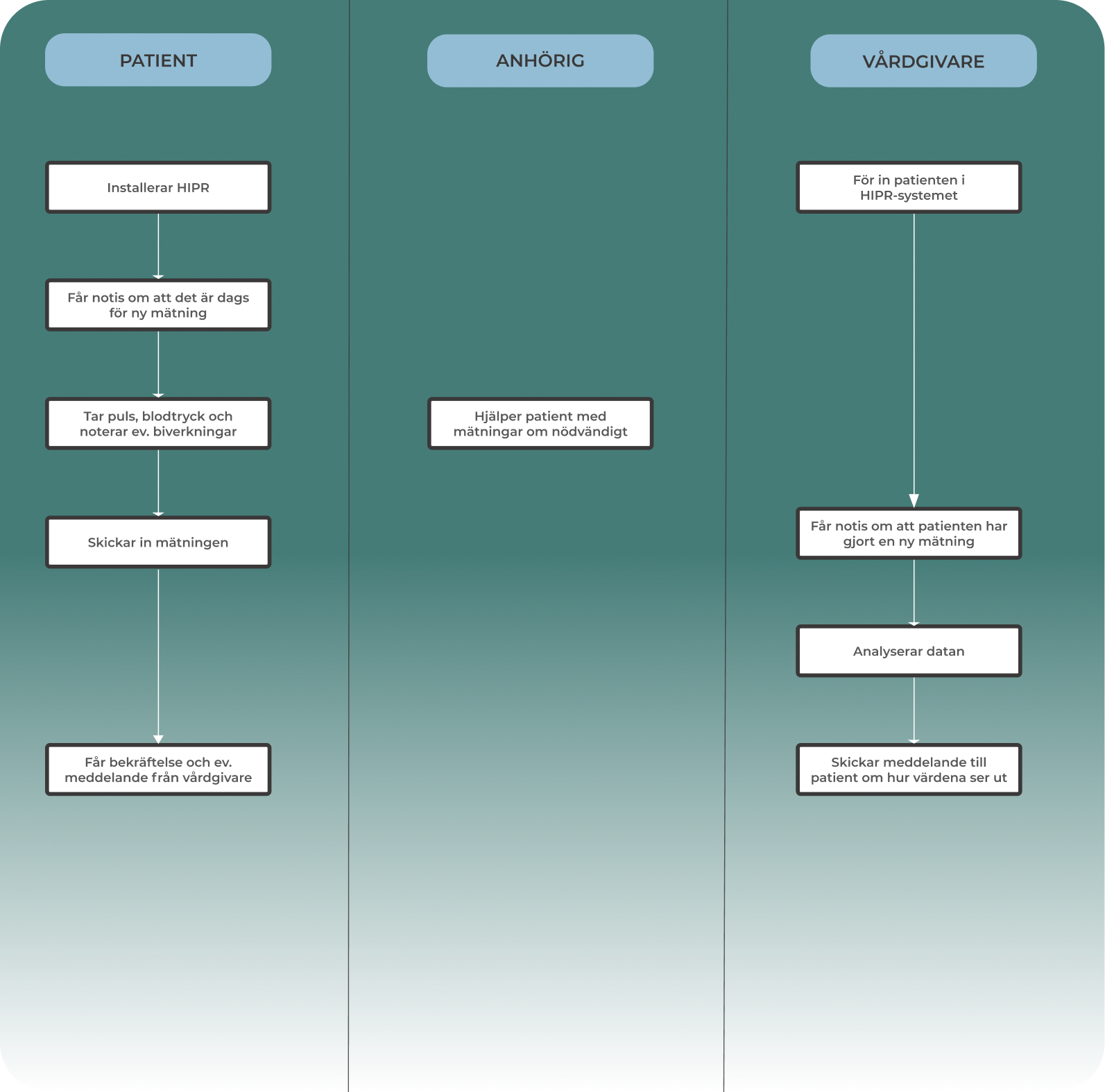
6 quality interviews with more open questions where the user can speak with freely After defining the personas, brainstorming user visuals, I chose to go with swim lanes.
Swim lane showcase how HIPR changes the titration process the best, from how many tasks get reduced in the process while giving free time to our three users: Patients, relatives/parents, and healthcare providers.
From the diagram we saw that users felt that the tritration process was difficult, the swimlane shows how many tasks the user need to go through during that process.

Synthesizing The Material
Problem Statements
A big percentage of young adults diagnosed with ADHD experience problems creating routines and retaining them. At the same time keeping track of booked times.
Our solution is to make them feel included in the process and reduce visits to the health center. Parents of children diagnosed with ADHD need a way to take part in the titration, it is to make them feel safe and in control.
Our solution to this is to create a profile for relatives/parents so that they can take part and feel included in the process while not being with them physically.


Ideating Solutions
When ideating our solutions we started with a "how might we?" workshop, generating and brainstorming ideas. We created a mindmap and a post-it canvas with solutions in mind.
The brainstorming session with "how might we?" clearly defined how we think of problems. Trying to evaluate the problem and then focus on solutions.
Our chosen solution were going to be implementing gamification in one way that would encourage the user into coming back to the app, making sure to log the numbers every day when taking the medicine.


Validating Design Concepts

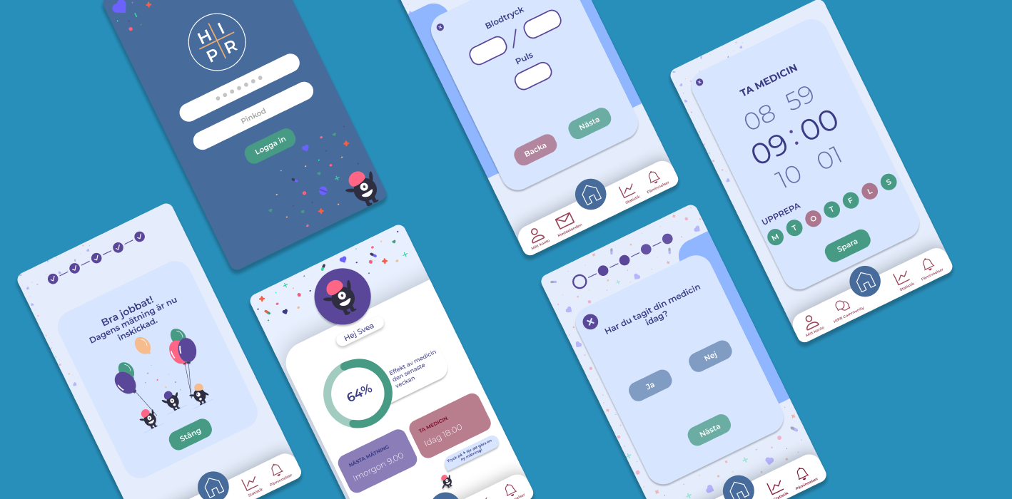
Low-Fi Prototypes

Testing Low-Fi Prototypes with users
When testing in a guerilla test, our starting point is our power map, and have in mind to be consequent with the navigation, structure, and layout. Trying to understand the logical flow from start to finish. We tried four different prototypes to see which one the users preferred and gathered feedback to finalize one prototype that we could apply our branding and visual element on.
Hi-Fi Prototype Development
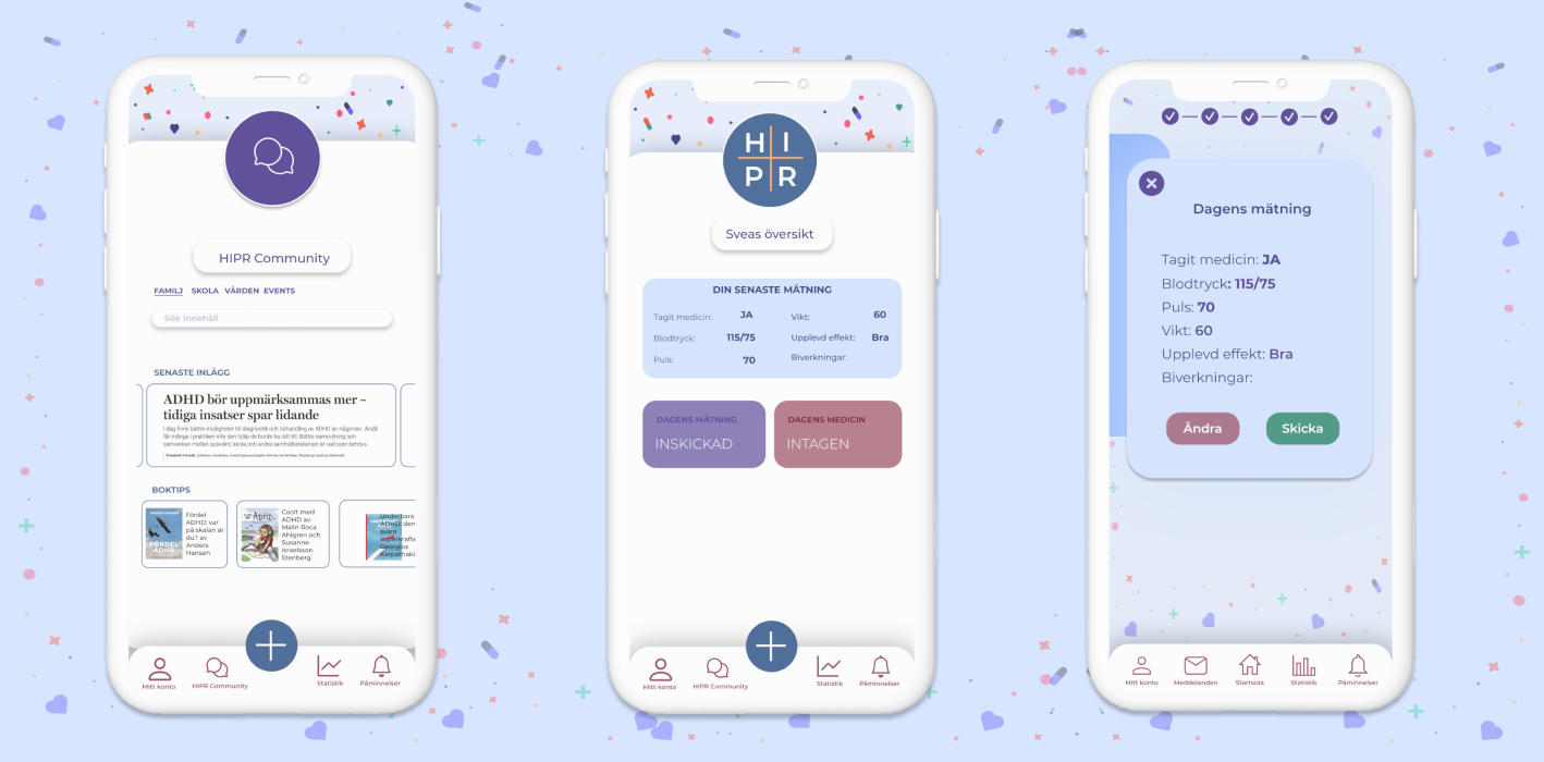
After applying our visual design and branding we wanted our target group to try our new app. The team was divided into two, one team having the task to finalize a titration going from start to finish.
The other team tested the alarm and notification function.
We wanted to see if the users encountered any problems during the test regarding architectural design, information, and the visual when trying to complete the task.
The goal for this user test was to see if our design decisions worked with the help of user's emotions and feedback during the test.

Results & Impacts
The flow was really great, everything looks really good. I smile when I log in.
Results showed that the list for eventual side effects was hard to recognize, it was not clear that it was a scrolling list, making the user confused and in the end not finding the side effect.
Our CTA "New measurement" button, was hard to see. The users eyes were aimed towards the middle and up, making the user confused on how to start. It was not easy to recognize where that button was because of all the colors.
A lot of things happen in the background with the colors and party elements. Making the user distracted and not focused. The user might feel frustrated when not knowing what to do, resulting in closing down the app.
Major Learnings
Teamplay
We started structuring up how we wanted to work and made a schedule, knowing how to work efficient with our given time, I learned to receive feedback better and openly discuss different opinions on how to solve our problem while maintaining a high standard.
Everyone got to speak up and bring forward ideas on how the problem should be solved.
Research Skills
During my time with Medilevel, I learned to search for the target group on my own, in a set time. This was the hardest part of the project but it did not set us back.
Project Management
In the beginning it was hard knowing what phase we would go through first, we used the wrong methods and way of working at the wrong time.
Resulting in us having to backtrack and change decisions we've already made.
Next for me to learn
My next goal is to apply the knowledge I've gained during this project. Thinking faster and making decision faster, by "Killing my darlings"
The future of HIPR
The future looks bright for HIPR, with a positive cash flow and vision on expanding.
Nothing is impossible, HIPR gained praise and prize after only being released in Gävleborg.
Done Different
I would've tested the app a lot more, after each iteration of design in the prototype. Also gathering more information from the target group earlier in the research part.
Lessons Learned & Going Forward
Difficult working with a client parallel to school
We struggled at the begining, searching for our target group, but when we found the users, they stayed with us during the whole process, giving us valueable feedback from the first interview to the last prototype. Another problem caused by COVID-19, was recruiting and conducting user test at a distance, forcing both the team and users to be flexible.
Research is the pillar to all good, every decision needs to have a strong case to back it up.