
UX
Project Details
Summary
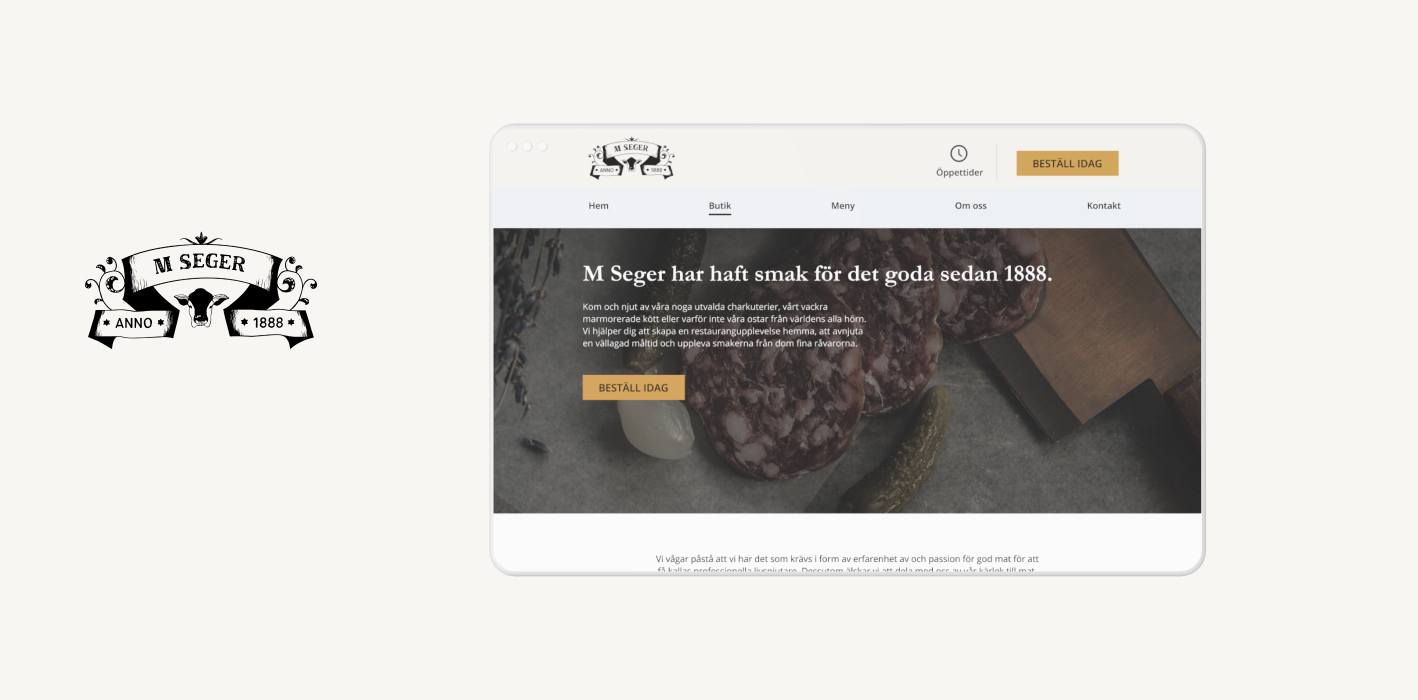
The opening of the “new” Östermalms Saluhall 2020 was a big headline in the newspapers, M Seger got a new owner. Håkan Lager together with the meat company Norvida AB. With a fresh start, the store needed a new modern look, an un updated page from 2017 awaited. I did research on other retail stores and came in contact with many visitors in the Market Hall. With their stories and problems as guests, I designed a responsive website that appeals and highlights the new M Seger. Check out the prototype and look around to see how guests navigate around. Continue reading below for my extensive process work and how I made my decisions to create the new M Seger.
Role
Tools
Timeline
Intro
When Östermalms Saluhall re-opened in 2020, M Seger got a new owner. The owner Håkan wanted to change the concept that M Seger had been running these past years, by providing the customers an experience they won't forget.
Focusing on the finest details in meat, charcuterie, cheese and dining experience. To celebrate the new start, Håkan decided to rebrand and update the feel for M Seger.
I reached out in November after seeing their new website, and gave it a go on my take for how the website should look and feel with their new updated brand colors and logo.
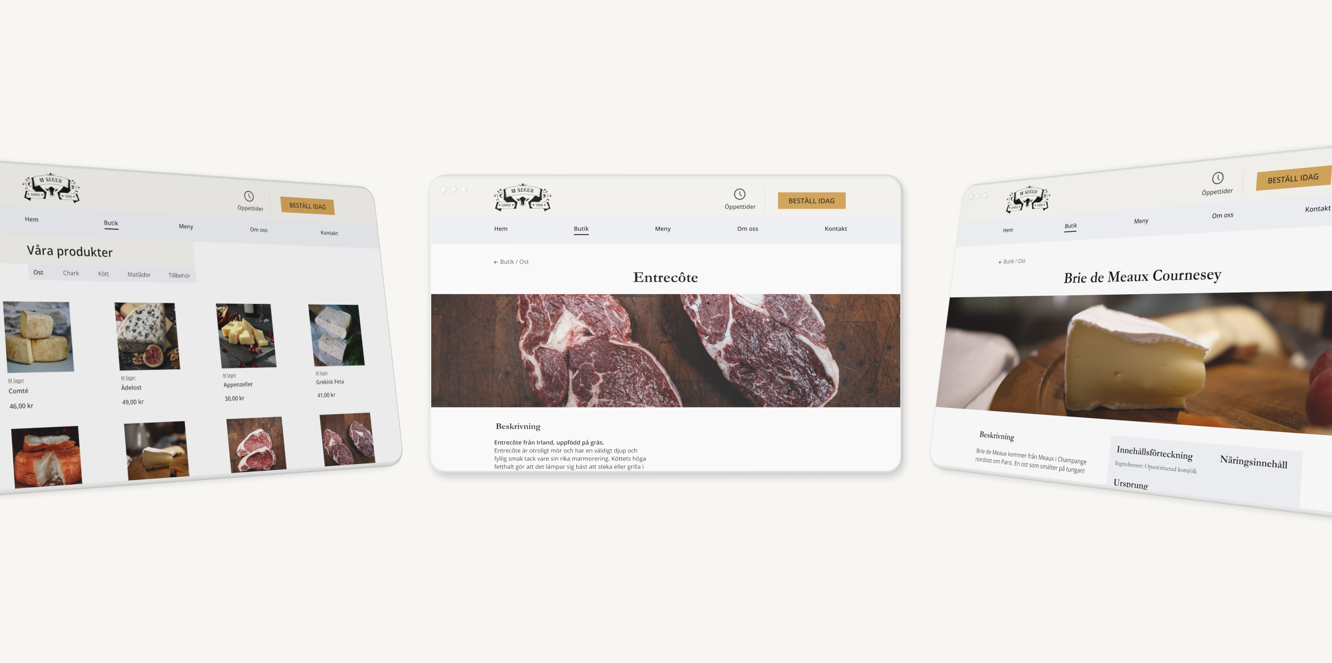
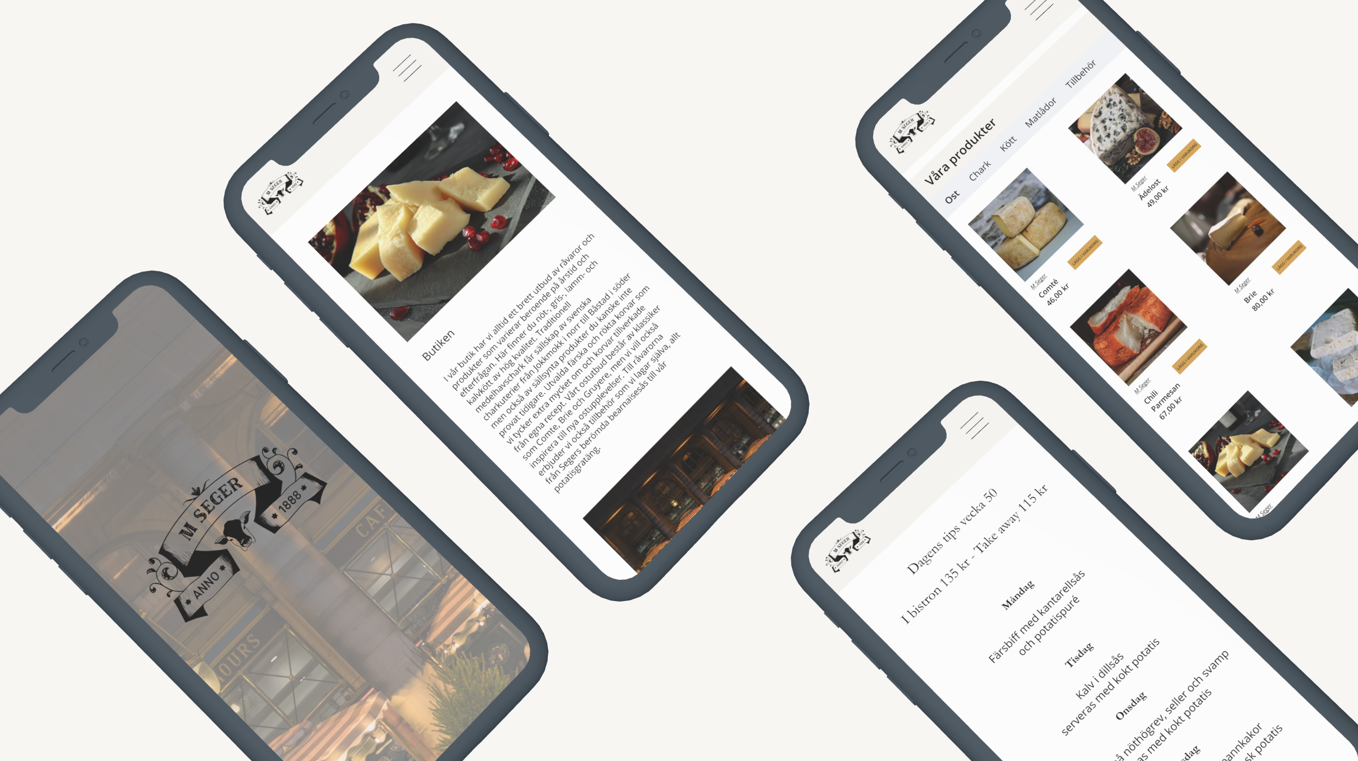
My goal was to create an e-commerce website where visitors want to stay and discover. Read about different cheeses and be able to order it home.
The Team
My first fictive case for a real client, in this project I managed the research part, discovering, exploring and defining. Continued with the design phase, developing wireframes, testing them and reiterating, always listening on the users so I could deliver the solutions users need.
The Challenge
I found it hard to know how to structure the new site to make it look more like an online shop. Users had no information about the different types of meat and cheeses that were available on the website, M Seger struggled with converting visitors to sales in store, users usually visited the old website only to look at the opening hours.
I began researching different restaurant websites gathering inspiration and also trying to find what makes the customer come back.
A survey was sent out to users visiting the market hall, some were randomly selected to participate in an interview if possible. Users spoke freely about the website, pointing out difficulties and places where it tickled.
I asked myself, "how can I create an online store that helps M Seger maintain their visitors?"

Breaking Down The Process
Understanding The User
Target group for this project, are visitors from the market hall, aged 30-75 years old. I wanted to maintain the atmosphere that the market hall gives, it's a special type of feeling that you get when you step into it.
The answers showed that most people aged 50-70 had problems when visiting the site, there was no clear goal for the users rather than just browsing around. Layout and look felt old, small pictures that did not bring any feeling to the user experience.
The typeface was also not liked amongst the older users. Having three different typefaces clashing with each other, causing reading problems for users. Bad contrast was also something I had to look into.


Synthesizing The Material
Problem Statements
How can I create a functional web store that helps M Seger maintain their visitors? I compiled a list of problem that users felt were most troublesome.
• Text is hard to read
• Don't know where to navigate (No end goal when visiting)
• 87% Drop off rate from landing page


Ideating Solutions
Trying to enhance and really bring out the feeling of a luxurious deli was my goal during the ideation phase. I wanted to fix the obvious problems that the users experienced and integrate solutions with the new branding.
During my ideation phase, ideas of creating a simple nav menu to ease the flow and navigation, a CTA-button for orders and develop an overall new feel for the website.
I made post-its in a Point of view statement. These four post-its summarized users needs and why.
Working from what I gathered helped me in discovering solutions that I could work on.


Validating Design Concepts

Low-Fi Prototypes

Testing Low-Fi Prototypes with users
The tests were done with the same group of people who tried the wireframes, and three new users. I received mixed feedback, positive and negative.
User groups were split into two, one group had the task to navigate to the online store and place an order, while the other group were free to browse back and forth. Goals with the tests was 75% success rate in placing an order and 80% were happy with the browsing experience.
Hi-Fi Prototype Development
In my last prototyping stage, I applied the visual design. Getting close to done, I managed to build an e-commerce site.
Now users were free to test it again, coming with feedback on the design and I tried looking and analyzing where users eyes were drawn to in an observation test.
Results & Impacts
This is exactly what I have been looking for! I can finally order the best cheese in Stockholm.
Ending this project was really fun, I learned a lot along the way. My biggest struggles was arranging tests on distance and site structure. I worked through different colors trying to make the CTA feel natural and not too aggressive.
I managed to talk to some visitors in the market hall, that had been on the website and got nice feedback. Many whom were going to visit M Seger again in the near future.
Major Learnings
Working alone
Working on my first project alongside my school project really sped up my learning skills, I could apply things that I learned along the way on both projects.
But downsides is of course not having anyone to discuss with.
Research
Thinking this was a small scope to work with was something that I regret. There were different ways of doing the research part, but I followed my plan on focusing on restaurant experience and design.
Since I had two projects at the same time, it took a bit longer to gather the information.
Managing the project
Fun managing my own project, I set deadlines for each week, following up tasks from the week before and always working towards my project goals.
For this project I had to set some free time, reading articles and browsing other restaurant websites.
Next project
This project really hit home, I felt comfortable working in my own pace, learning along the way. Up next for me is to challenge myself creating things that I have no prior experience in.
That will be the most challenging task I've done!
M Seger in the future
M Seger will succeed and provide the customers with the best experience anyone can get. The work and passion that they put into their deli is amazing.
I love the new rebranding and the way Håkan has changed the concept of taste.
In another way
I think if there was more time to work with, I could've put in more effort into finding more users that would test my prototypes. But time caught up and I just went with my deadlines and progressed each week.
And if I had more time I would try working more with the colors, since that phase was one of the hardest to manage and progress in.
Lessons Learned & Going Forward
With my first project for a client being done, I want to challenge myself even more. Im going to try and discover other websites and applications that could see a change. It was fun working alone and managing my own deadlines and
I see M Seger in the future as the most known deli in Stockholm!